WINN CREATIVE
54-III
HOSPITALITY | VISUAL BRAND IDENTITY, LOGO DESIGN, PRODUCT DESIGN,
CROSS-CHANNEL MEDIA DEVELOPMENT | Art Direction, Graphic Design, Photography

54-III (pronounced: fifty-four, three) began with the idea to rebrand Studio 54 if it resumed operation
in the 21st century. To homage the club’s infamous “velvet rope” door policy and tragically short
three-year run from 1978-1981, 54-III maintains its exclusivity in only holding operations for three years.
Guests who cannot gain entry will never again have their chance to be a part of the greatest party on earth.


With Studio 54’s deeply iconic legacy in mind, I optioned to revise the original logo in lieu of a
complete re-design. The original logo featured several points of incongruence and varying thickness.
These were addressed in the revision while incorporating “III” into the tail of the character 4.
The III maintains the geometric principles used by original Studio 54 logo designer Gill Lesser.
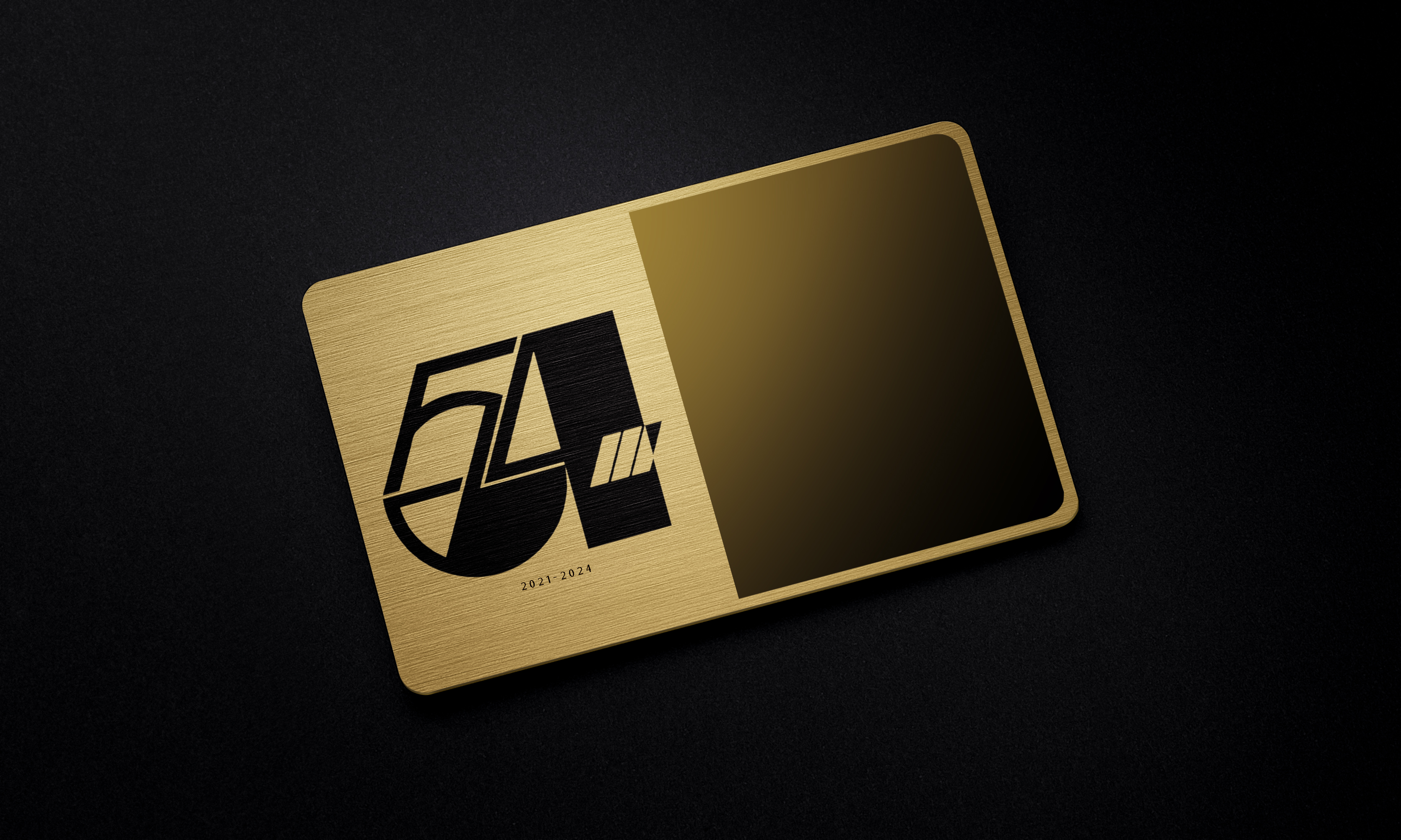
The membership card with its suggestive mirror surface (exclusive to the Bianca Jagger’s, Debbie Harry’s,
and Andy Warhol’s of today) was inspired by Playboy Club Member keys and Webster Hall party tokens.
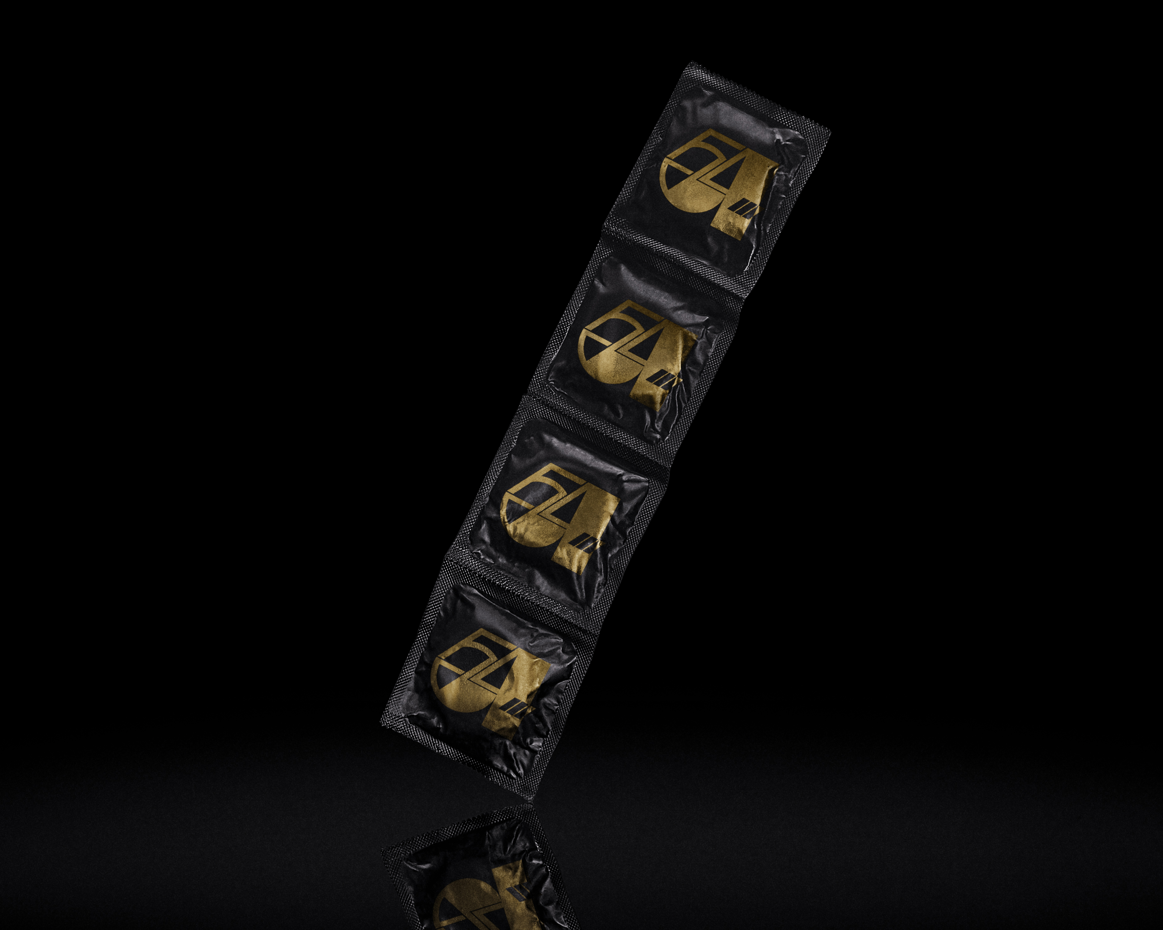
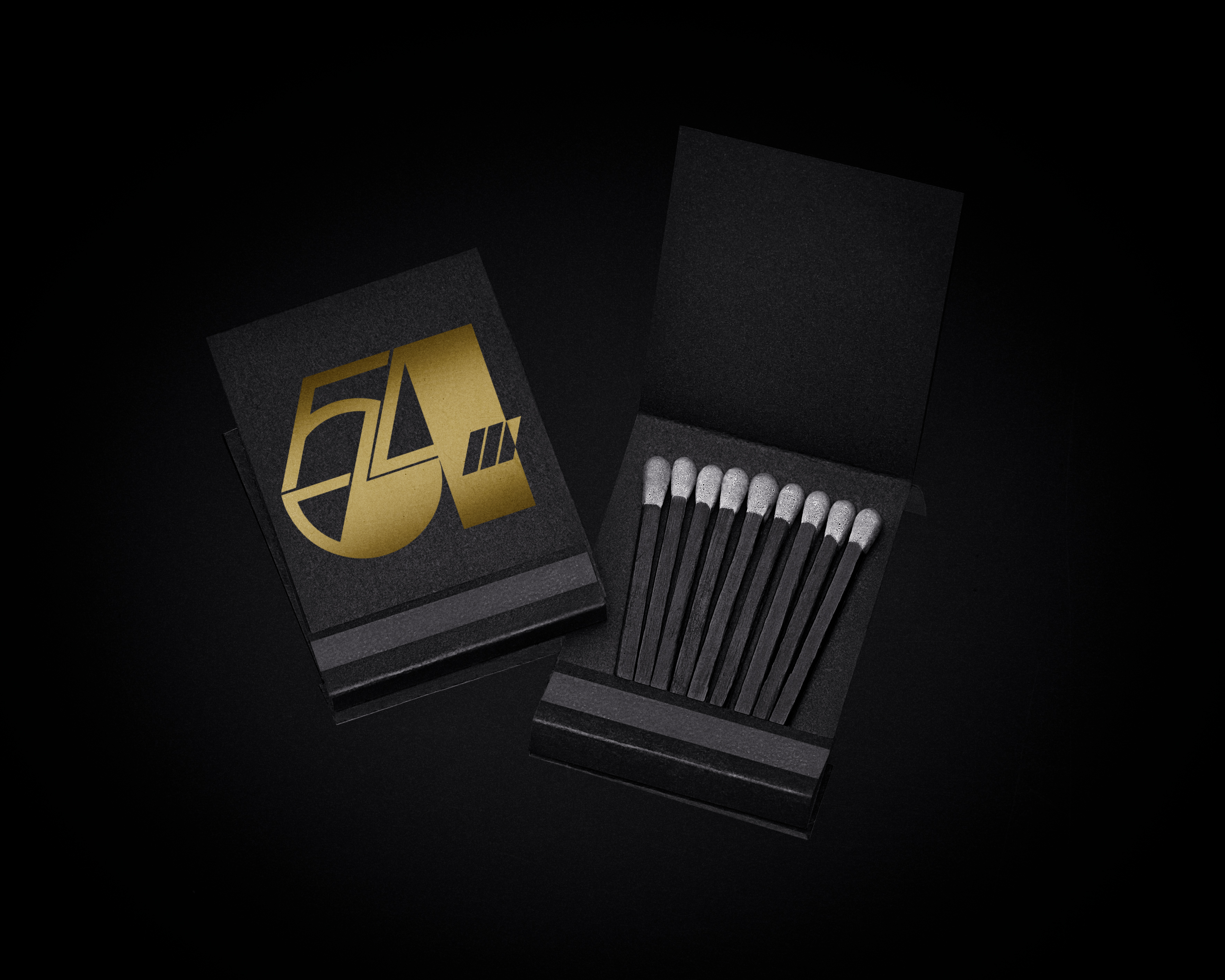
The club paraphernalia were conceptualized to hit all pillars of vice (drugs, sex, alcohol, gluttony). Note
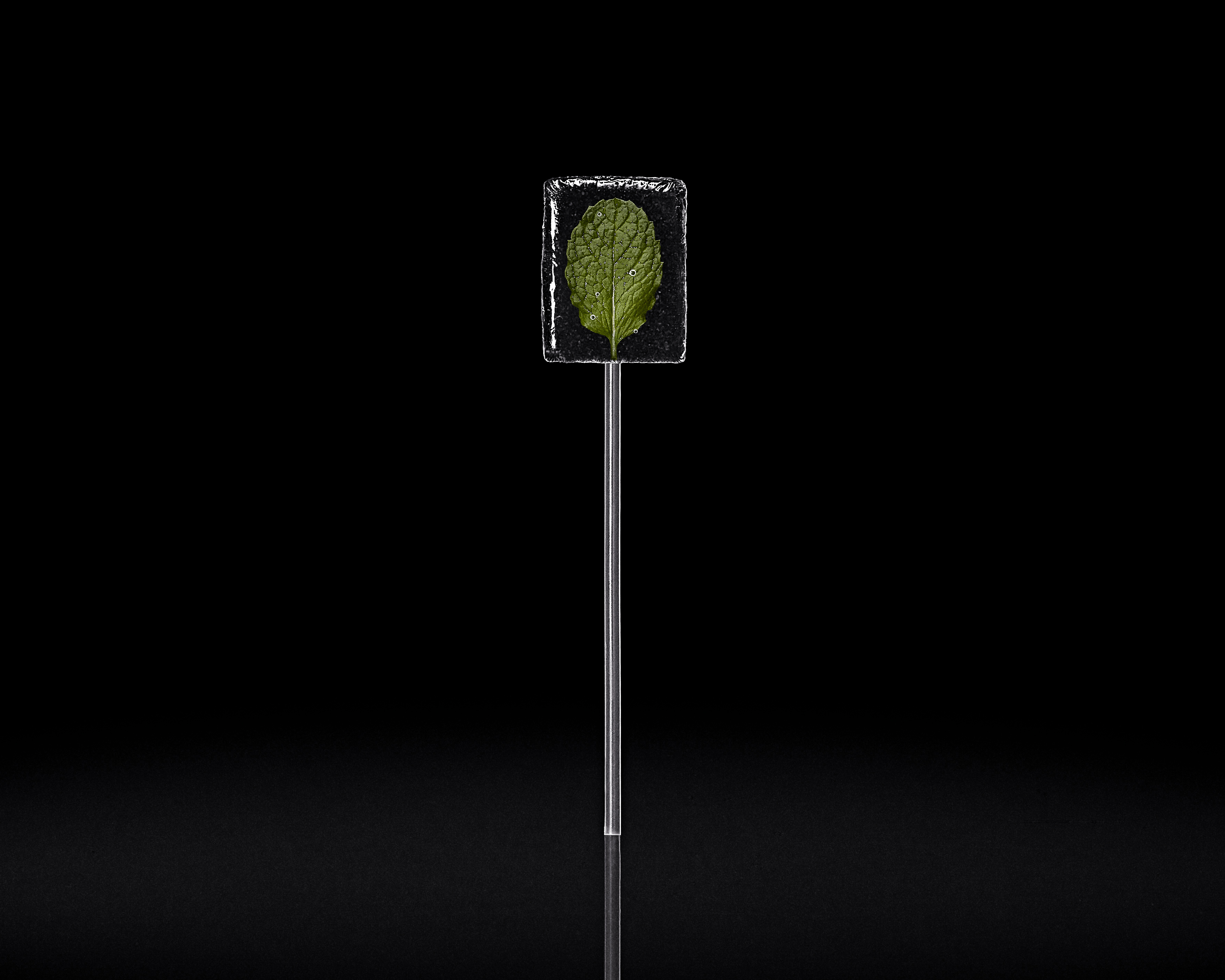
that the multi-functional drink stirrer and spoon were inspired by the club’s famous “Man on the Moon/Spoon”
set piece. The sucker is also inspired by the club’s tradition of handing out candy to guests at closing time.
The leaf featured within the sucker is mint.
Original photography was used for all assets. Heavy photo manipulation was used to transform and
build certain pieces that were not physically created (membership card, matchbook, drink stirrer/spoon).
Physical candy was created for the project.