WINN CREATIVE
NETFLIX'S PAN AM
ENTERTAINMENT | CROSS-CHANNEL CREATIVE DESIGN & MULTIMEDIA ASSET
DEVELOPMENT | Art Direction, Graphic Design, Image Manipulation, Poster Design, Copywriting, Gif Making, Video Editing.
A starter social media campaign for the 2011 ABC show, PAN AM,
envisioned as a never-before-seen Netflix Original Series.
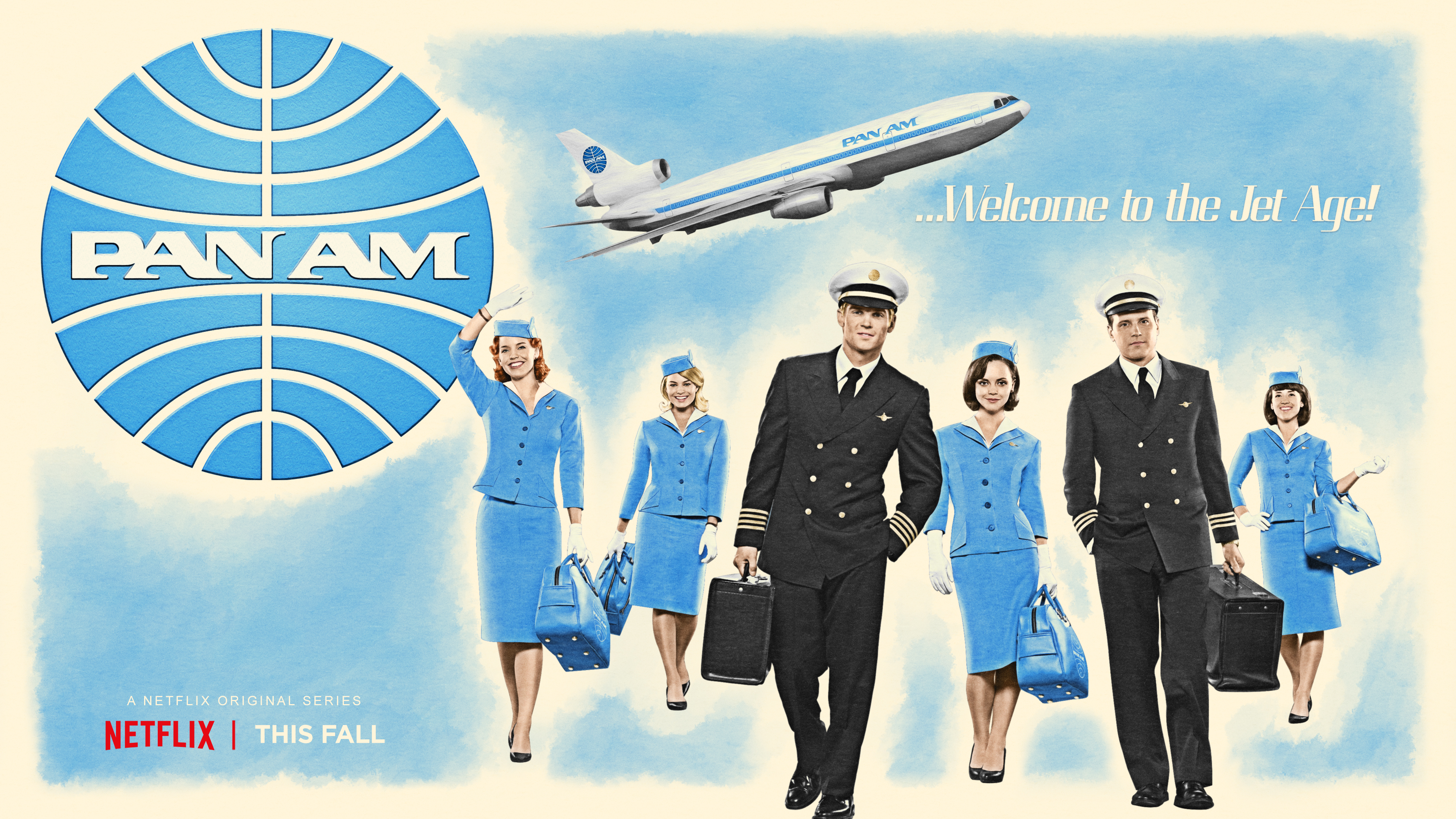
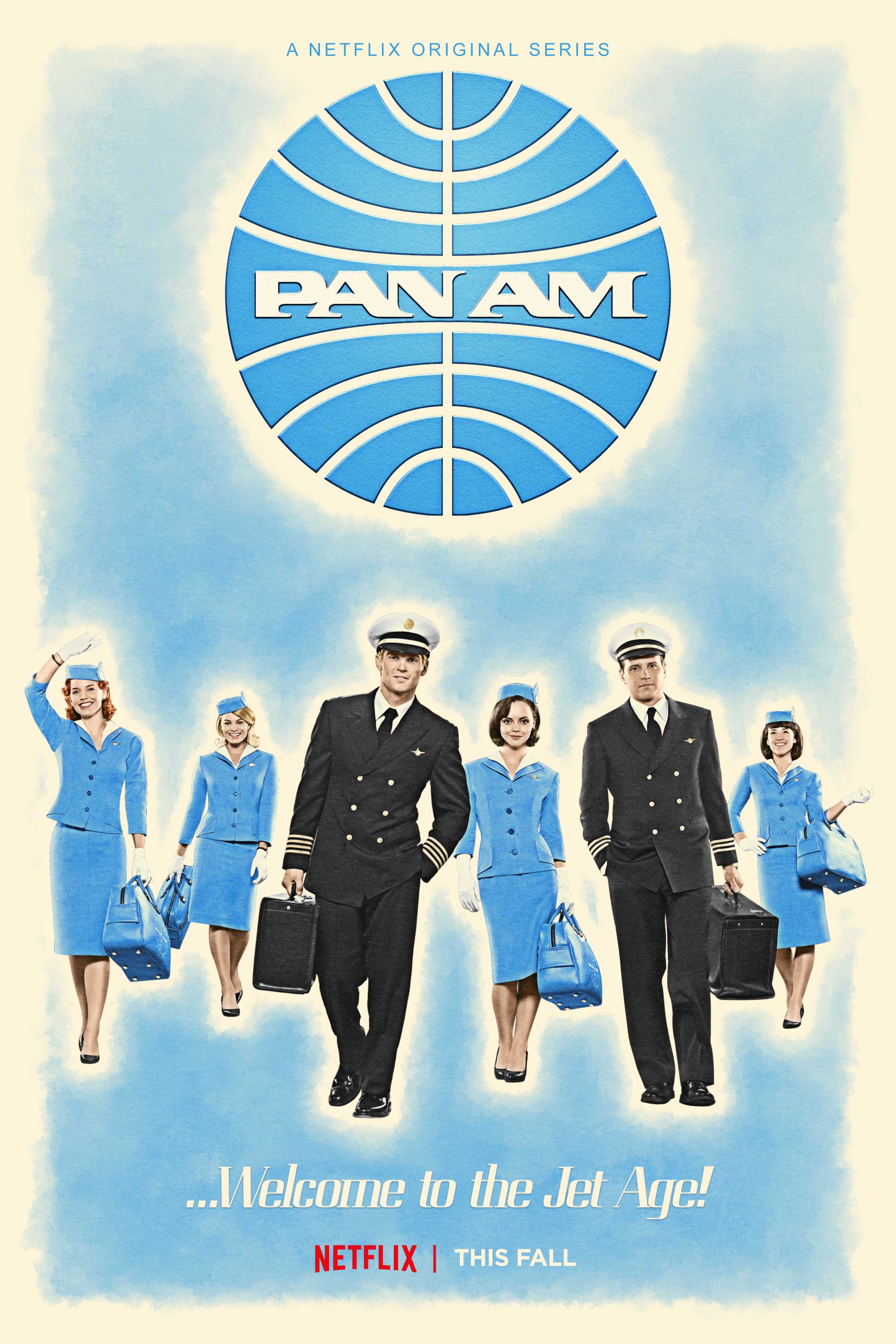
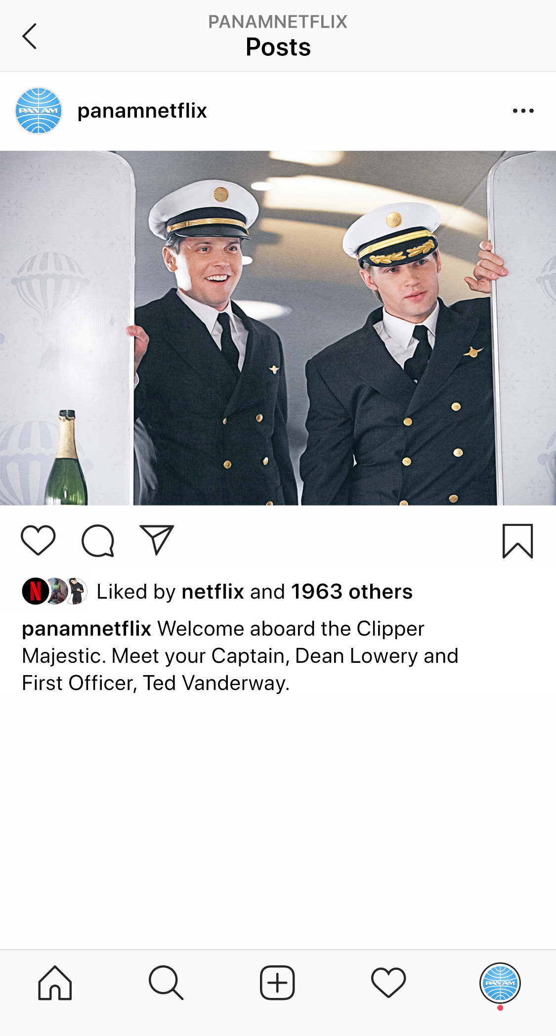
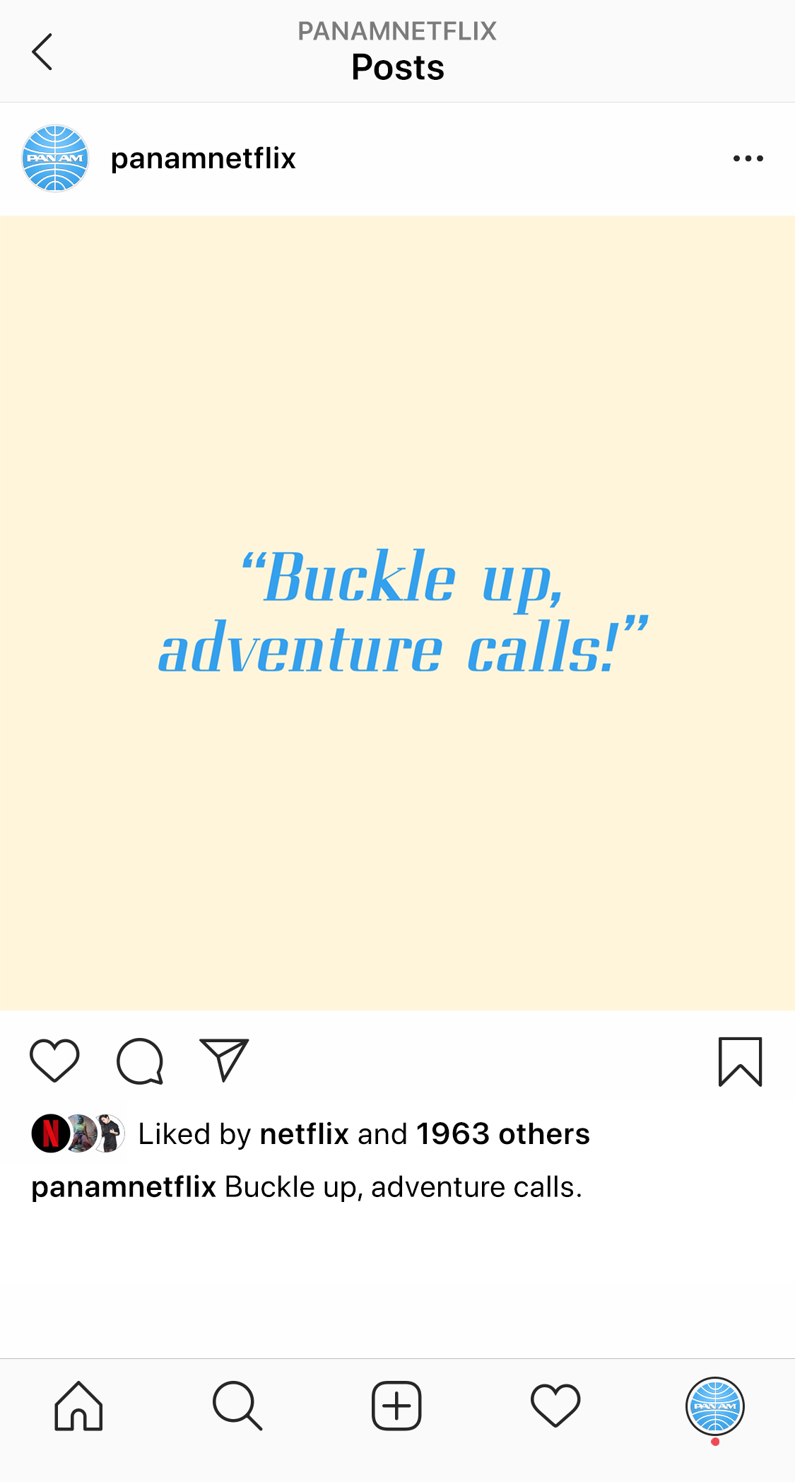
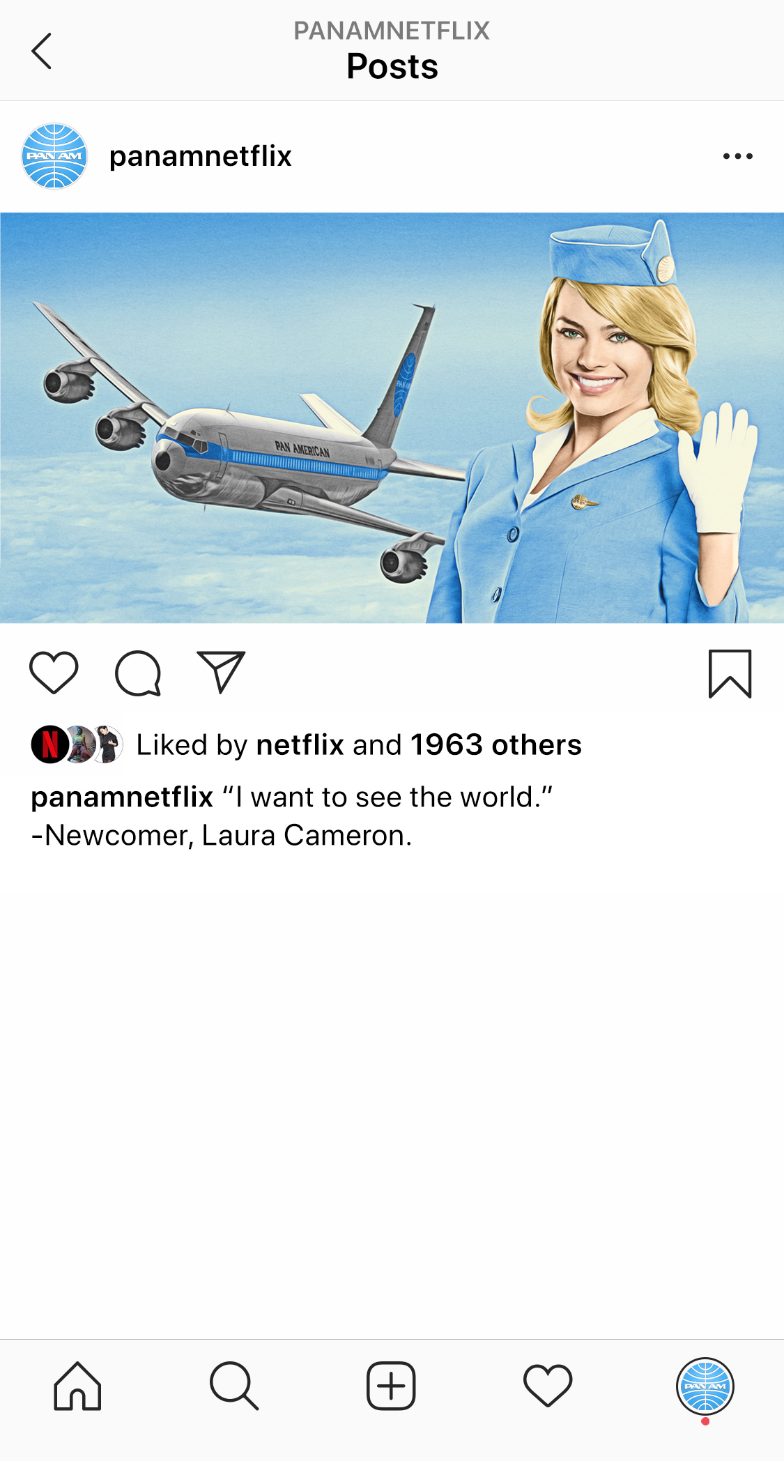
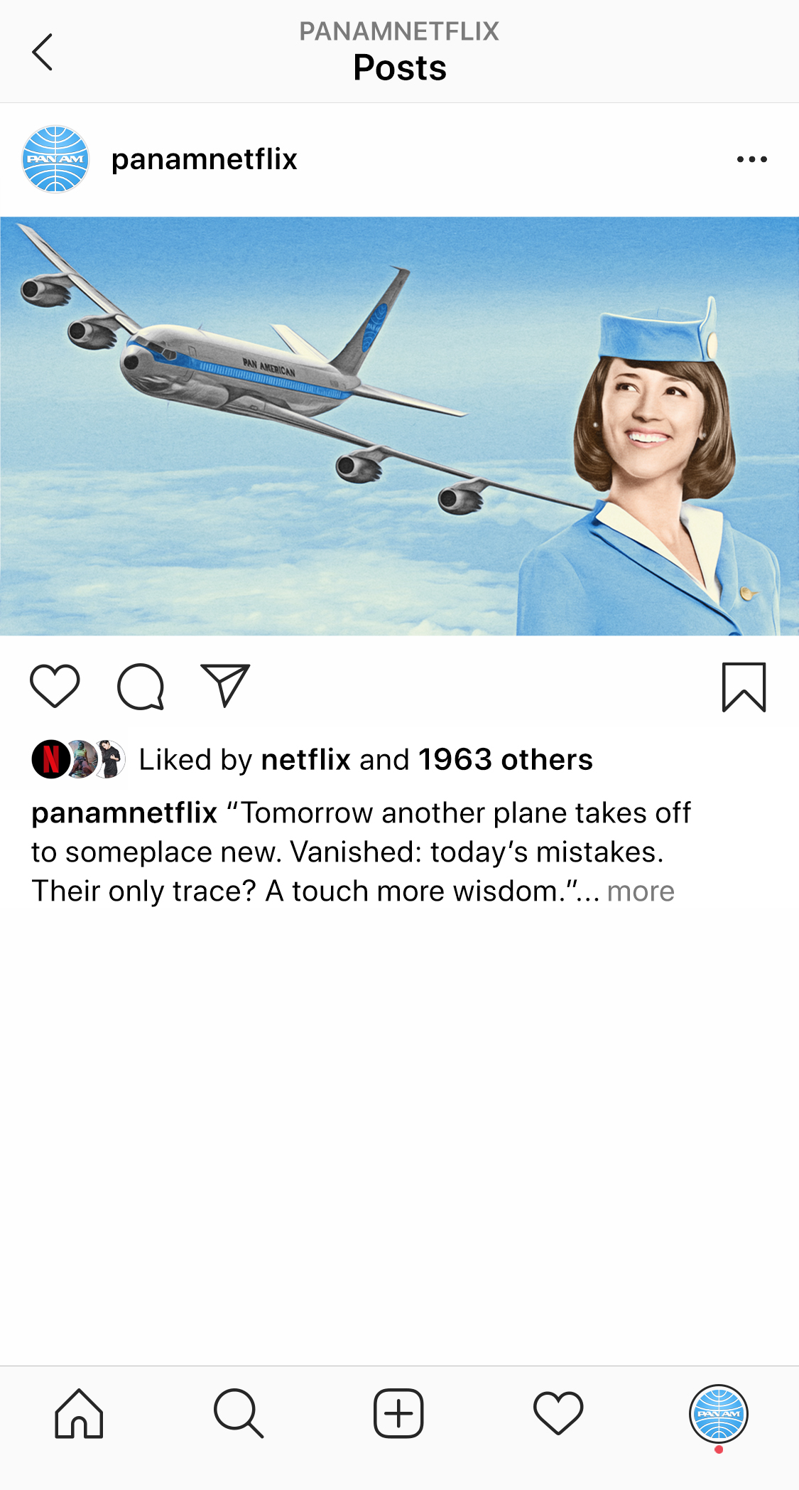
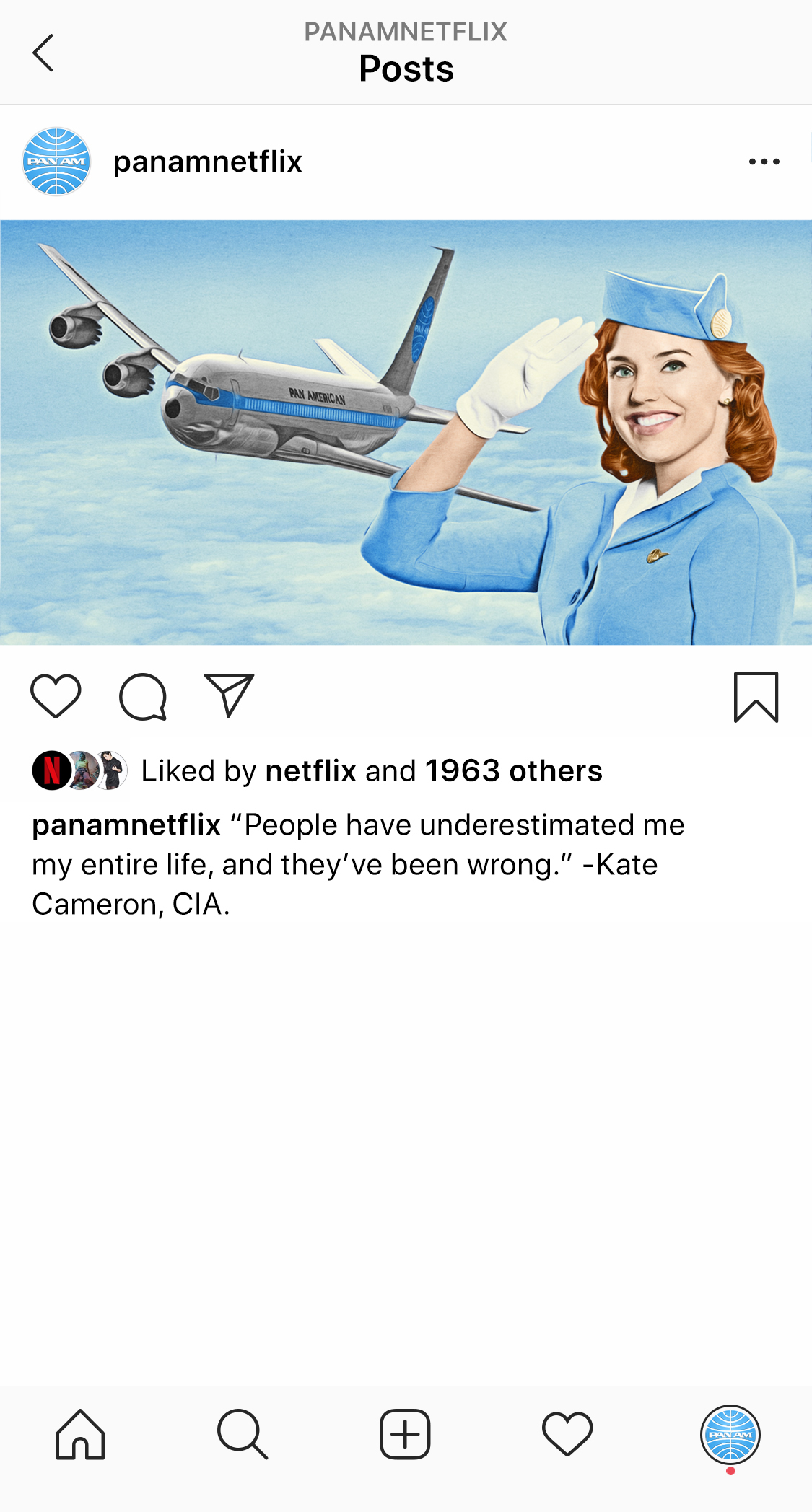
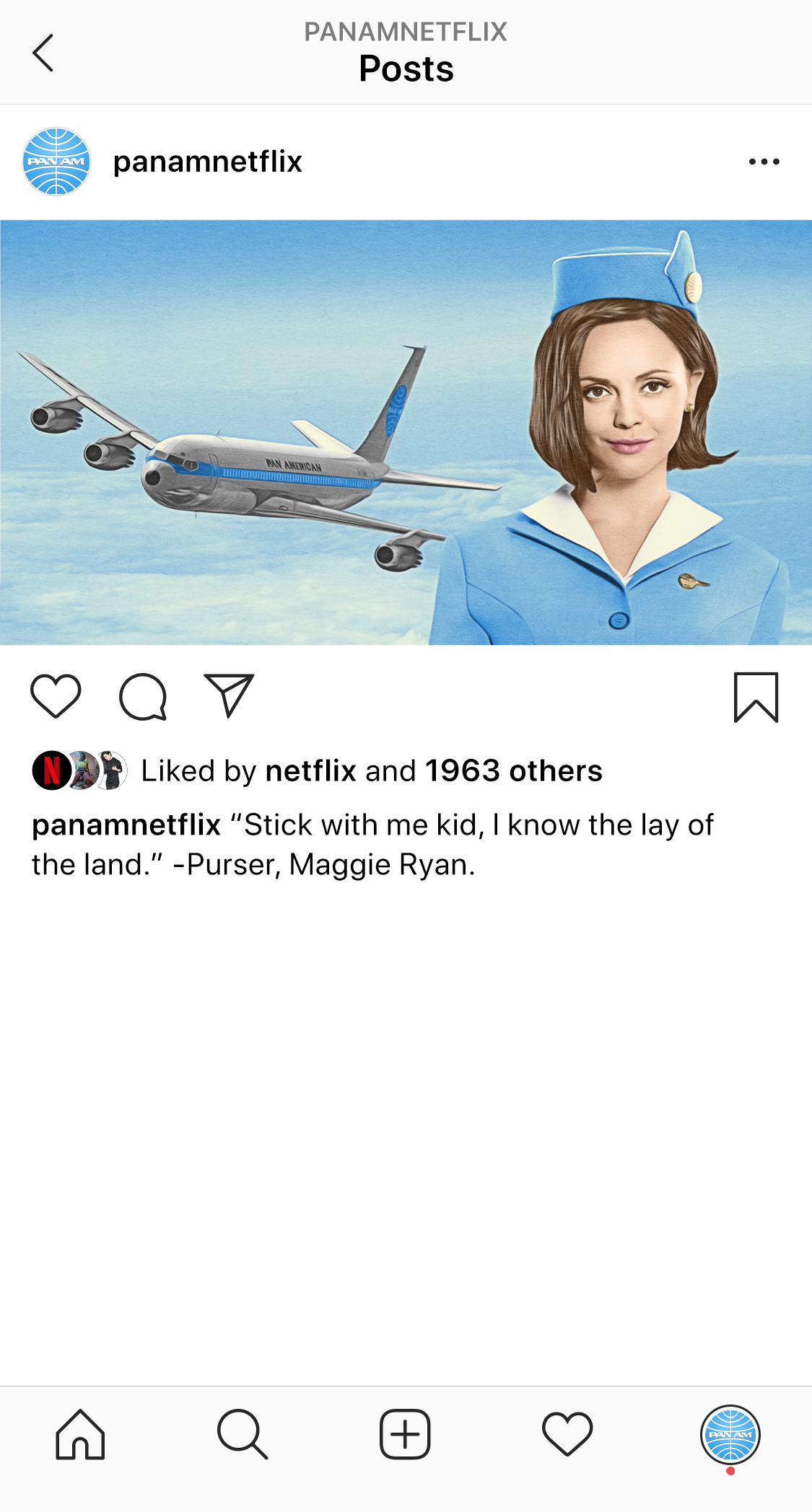
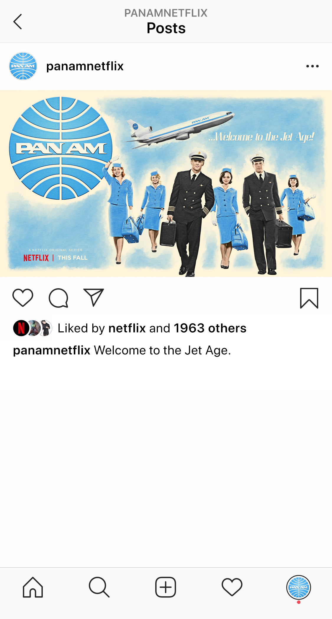
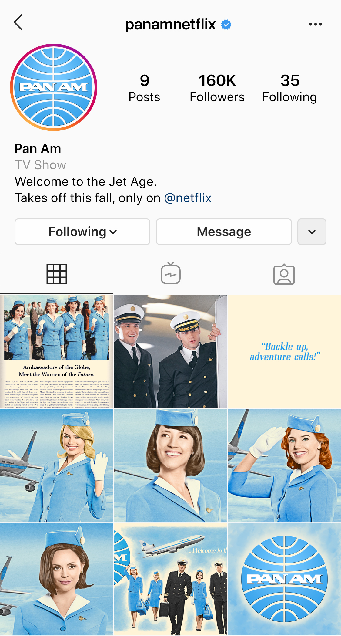
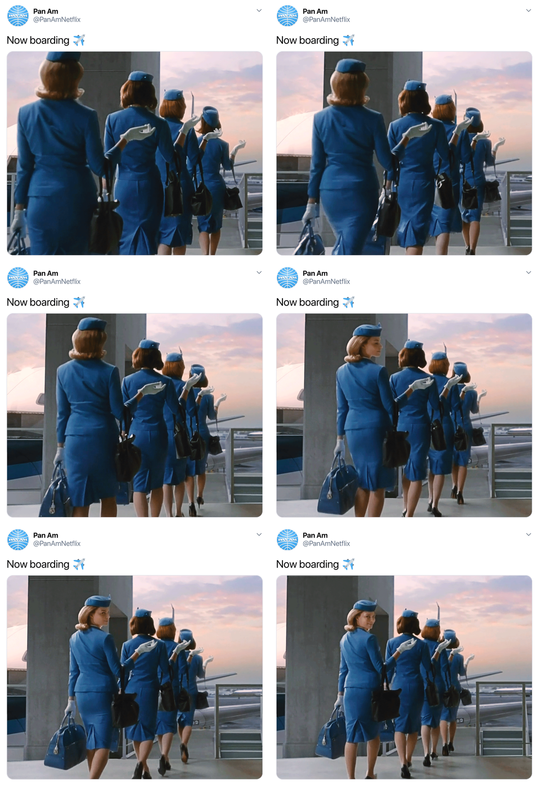
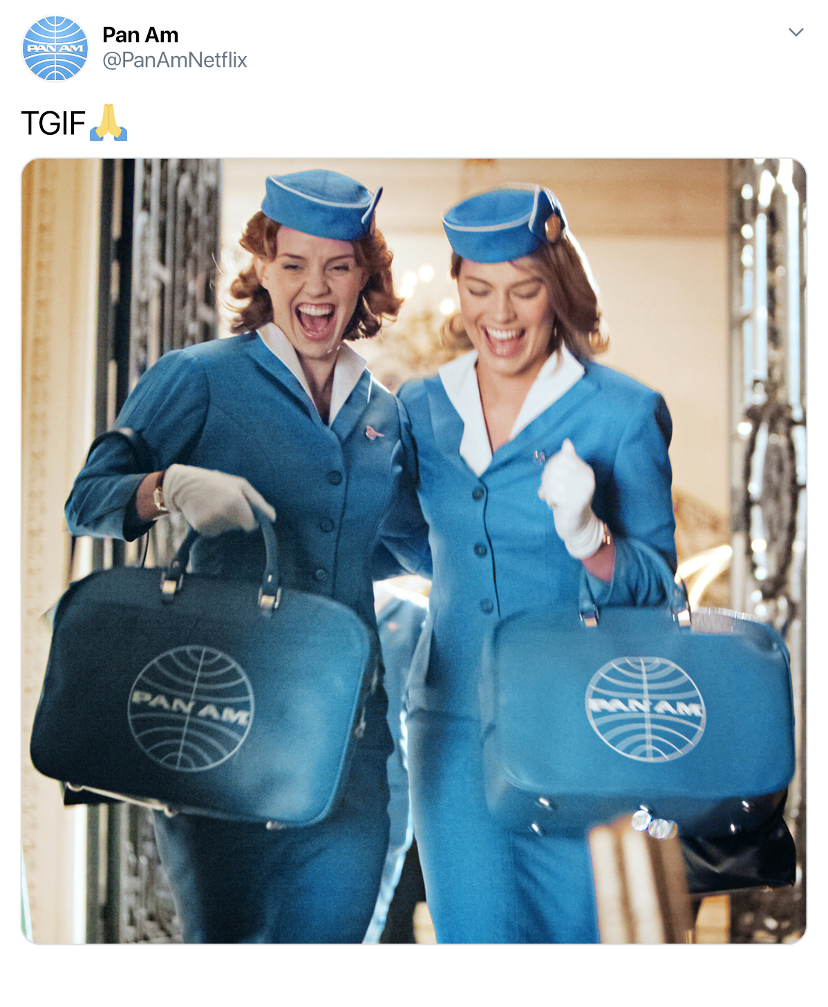
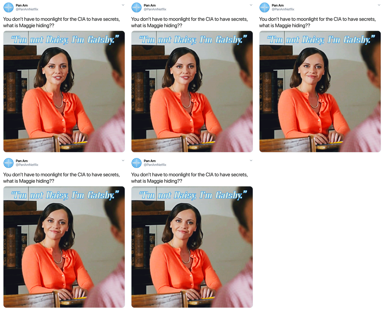
Studying the feeds for other Netflix Original Series, I began with introducing the brand and cast for the show.
The “postcard” style images of the stewardesses were already created by the show’s art department in 2011.
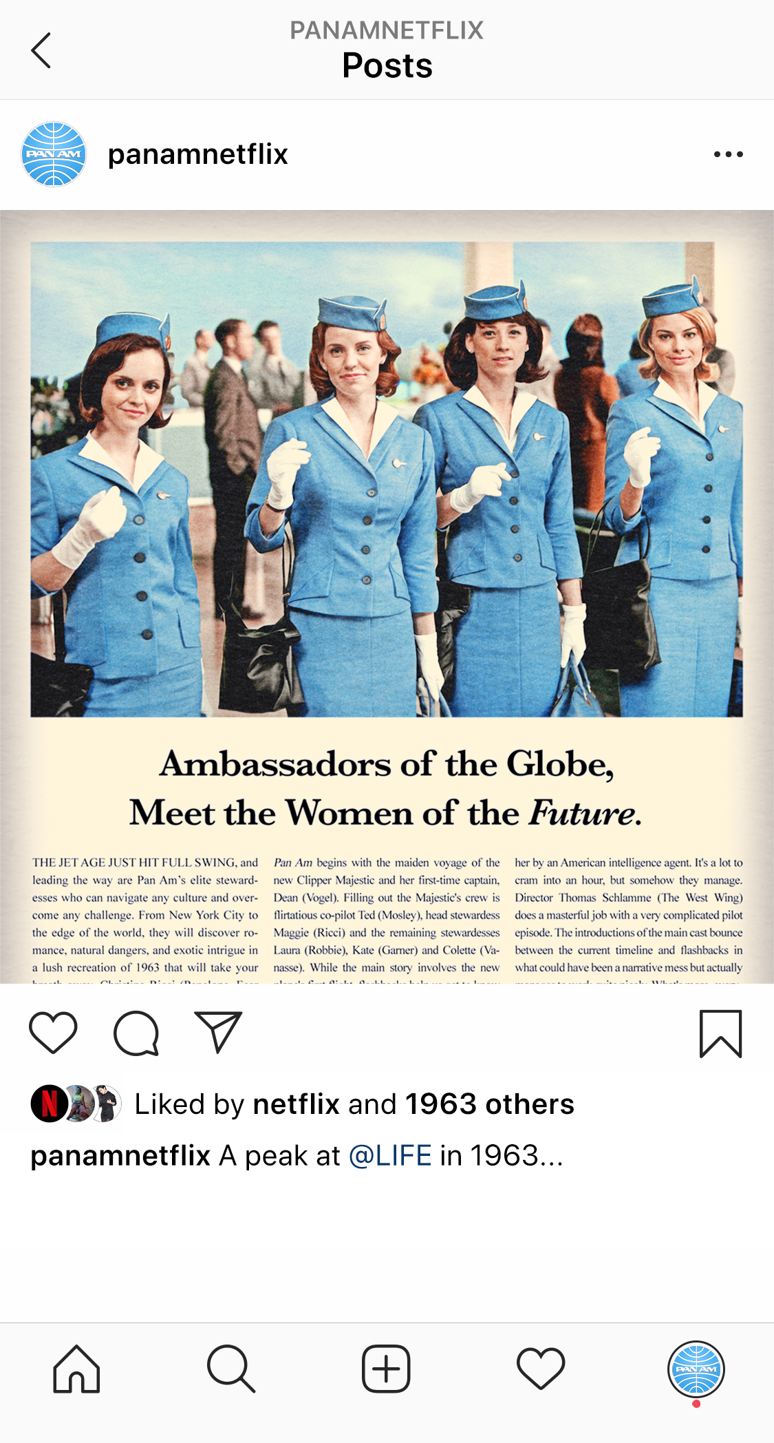
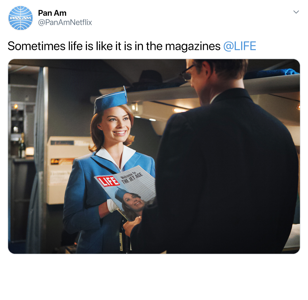
I applied my custom print treatment to these images as well. For the final image in the grid, I created a faux
LIFE Magazine editorial. The editorial combines copy from the DVD packaging and a review by TIME OUT.
RESEARCH
After watching the show, I perused real hard copies
of LIFE Magazine from 1963. I studied the illustration,
typography, copywriting, and aesthetic hallmarks from
the time. From there I collected every image I could
find related to the 2011 show. I also had to become
an expert with Instagram, Twitter, and Spotify to
build out their interfaces from scratch.
PROJECT LENGTH: 4 days research, 1 week
production.
PROCESS
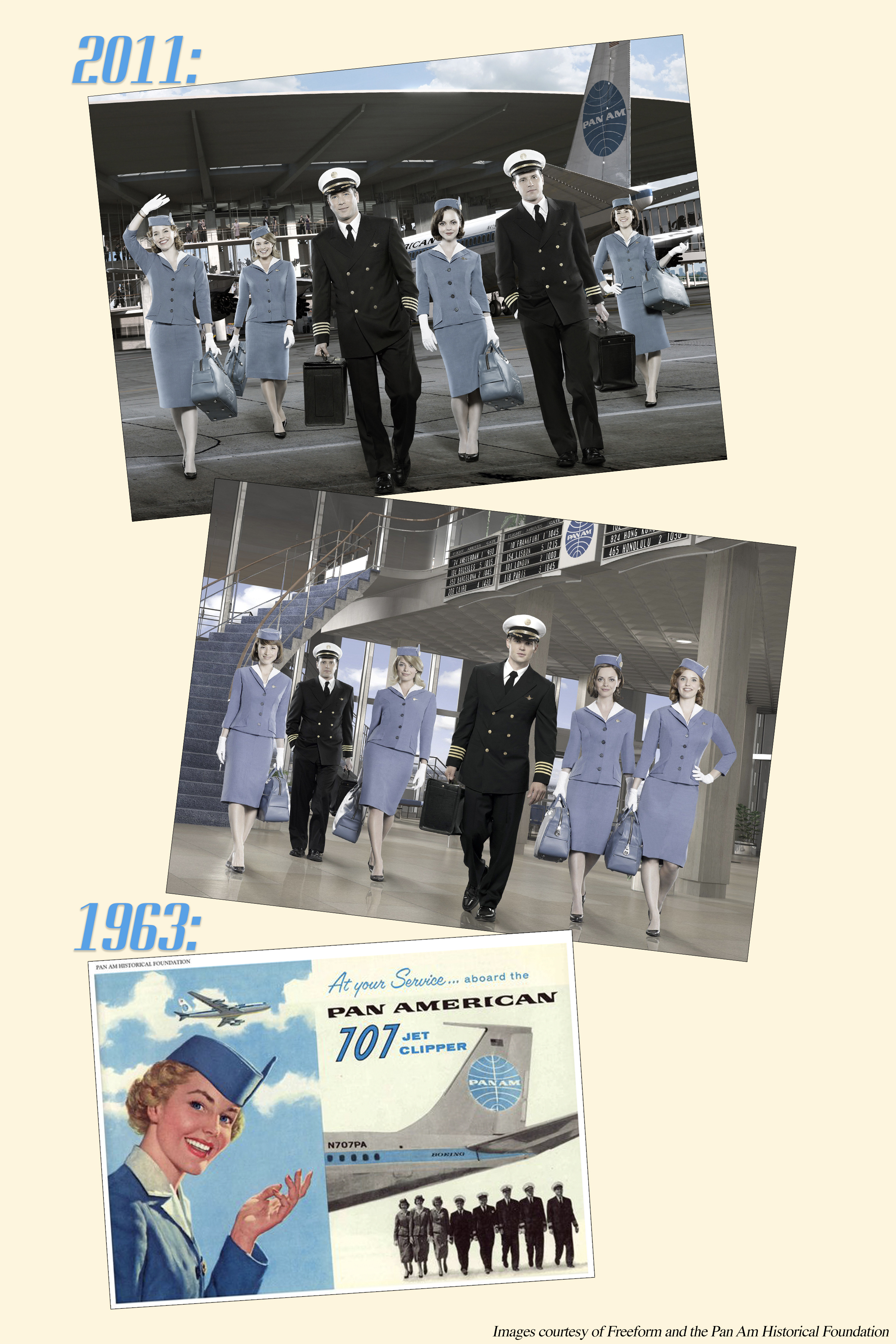
Using only images released with the 2011 show, I
repurposed portraits, set photos, and screencaptures
to adhere to the nostalgic aesthetic I envisioned
for the show. The “print treatment” consisted of
desaturating all images and recoloring them piece
by piece. Each image had roughly six masks applied
to unify colors. These images underwent a careful
blurring and sharpening process that ultimately
resembled illustration before the widespread adoption
of photography in advertising. I also incorporated actual
digital illustration in painting the watercolor “sky” in
the posters. The final package of assets accomplishes a
cohesiveness the original campaign did not have.
With the newly selected Pan Am blue, all images
present a vibrance that is fresh with every viewing.
